Efuel MVP
Client
Efuel
My contribution
User Research
UX & UI Design
Prototyping
Year
2023
Goal
Starting with a clear goal: get people to use it
Efuel was an early-stage startup with a critical objective: drive user adoption. To validate the concept and gain momentum, our MVP focused on delivering immediate, tangible value—helping EV owners save money on home charging.
User Problem
Electricity is complicated—our users just wanted simplicity
Target audience: Urban EV owners under variable electricity rates.
Research revealed a consistent pain point: users had little awareness of electricity pricing, often charging at peak times by accident. While our internal stakeholders had deep domain knowledge, users didn’t—and the gap was costing them.
Core idea
Our Core Idea: Smart Charging That Does the Thinking
We designed a simple, automated feature: users set a price threshold, and the app automatically schedules charging when prices drop. It gave users control over cost, without requiring deep understanding of energy markets.
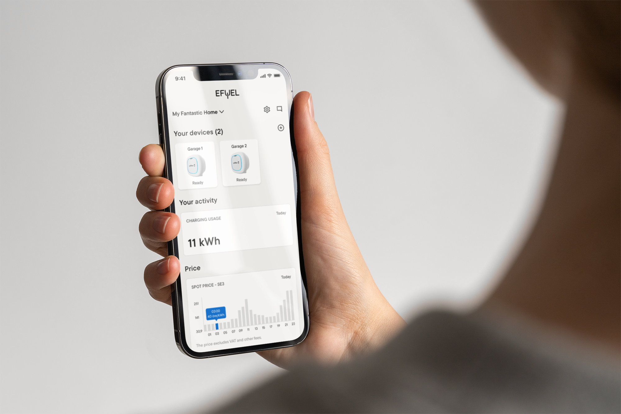
Design Iterations
From Technical Detail to Price Simplicity
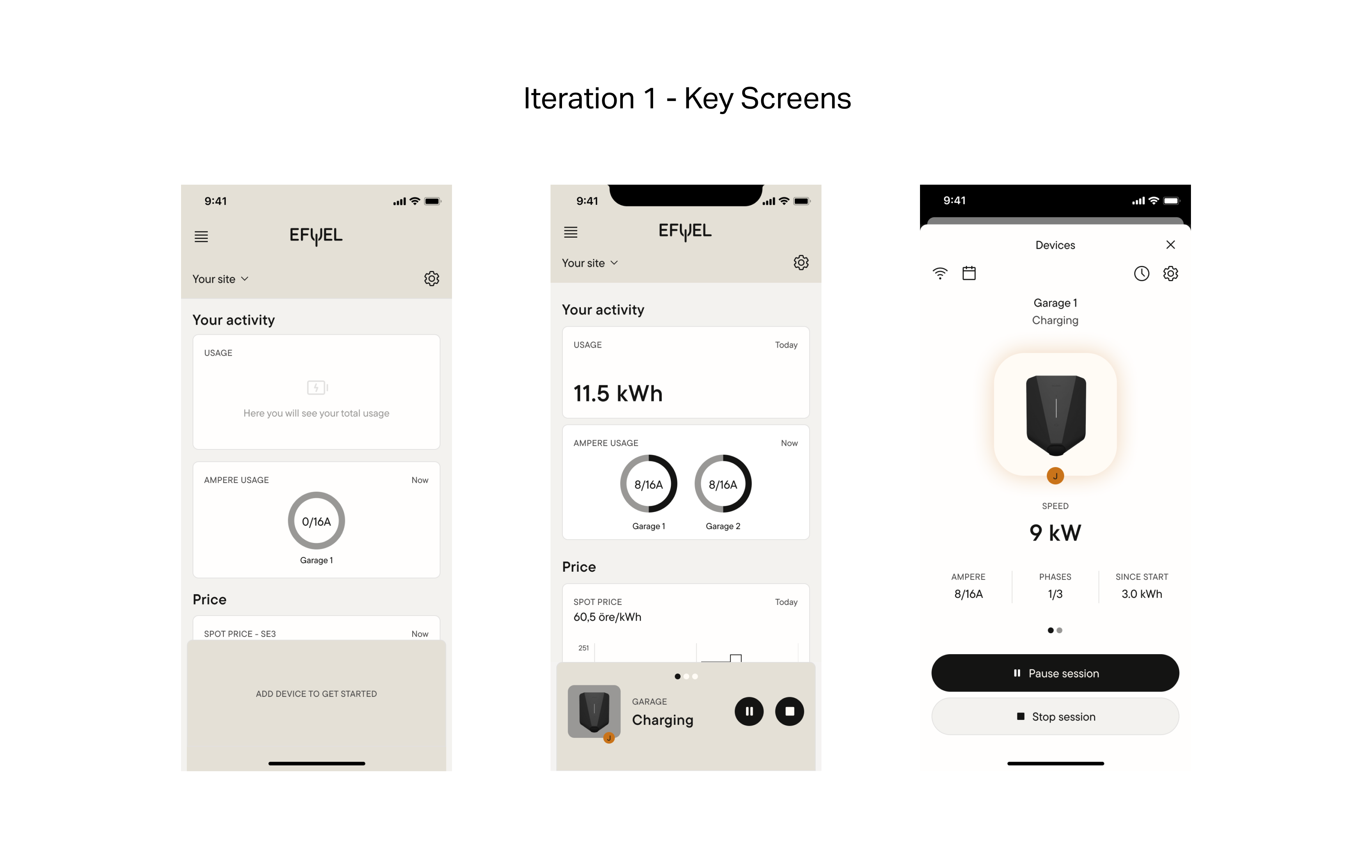
Iteration 1: Discovery
Our first design leaned into lifting technical information—with ampere controls and detailed data.
- Provide technical information, clarifying how the charging is going.
- Testing made it clear: users felt overwhelmed.
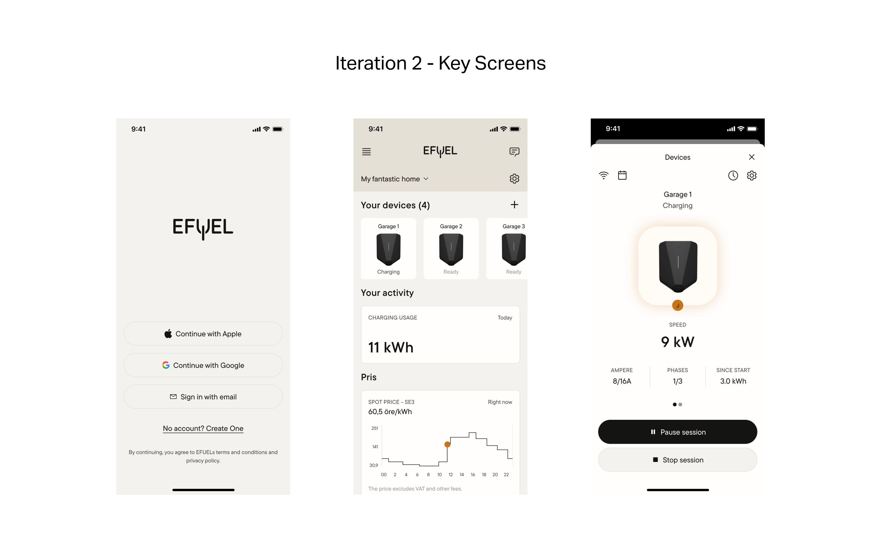
Iteration 2: Simplification
- Shifted to a price-centric focus on the screen with spot price chart.
- Removed unnecessary details about amperes on home screen.
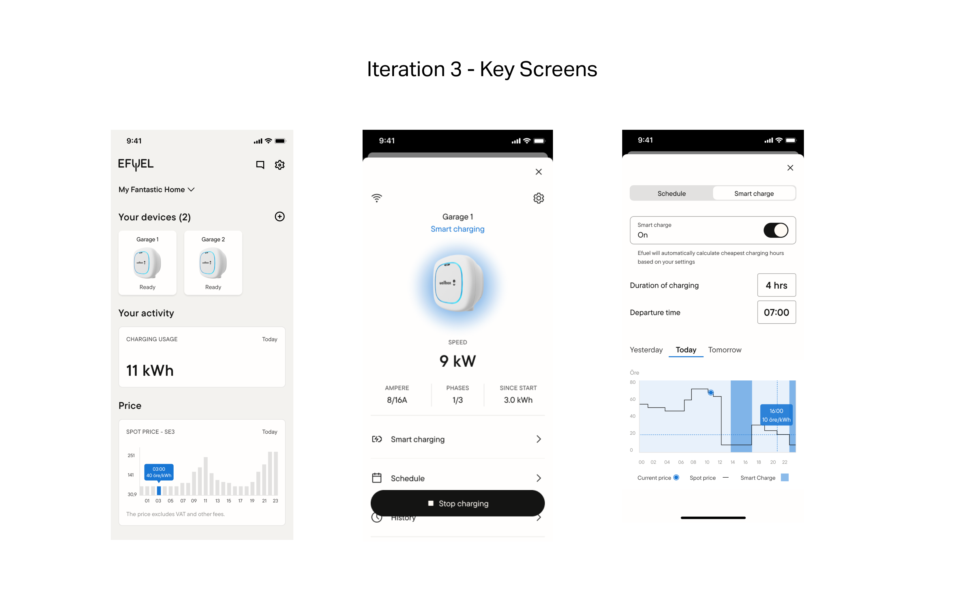
Iteration 3: Polish
- Change over to a new primary color and updated the Spot price graph to be easier to read.
- Introduced the SmartCharging and Scheduled charging features for optimised pricing.
Outcome & next steps
- Positive user feedback: Usability testing showed strong interest in smart charging, with clear demand for cost-saving features.
- Unfortunately, the company closed before launch, so we weren’t able to validate in-market metrics. Still, the MVP served as a solid proof of concept and showed strong alignment with user needs.
Key learnings
- Design for user understanding, not internal expertise:
Testing revealed how little users know about electricity—prompting a shift away from technically correct but confusing designs.
- Polish requires focused trade-offs:
With a small team, we had to prioritize where to invest in polish, learning to balance quality with speed in an MVP context. For example, the charger animation also added key usability to the app.
- Launching is harder than building:
I learned that getting an MVP into real users’ hands is often more challenging than designing it—especially when balancing technical readiness, stakeholder expectations, and market timing.